
Back in August 2020, as I was getting ready to submit Not Phở to the App Store for review, I realized that I needed a product website. Up until that point, I had roughly one year of iOS development experience and none of web development, but luckily I found an old HTML & CSS book at home that I could get started with. I didn’t get far into the book before I got bored and gave up reading the entire book from beginning to end, just flipping through until I found something that looked like what I could use.
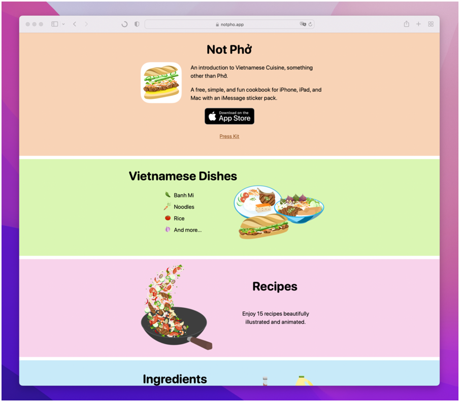
I had no idea what I was doing the first time around when I built this website. I wasn’t sure what a product website should look like and what sort of information should go on there, so I based it on what the app looked like at the time. In the app, the content was divided up into tabs so I did the same for the website and highlighted those sections with some text and images, a link to the app store, some contact links, and that was it. The website was very simple and I was okay with that because in the end, the app was the focus, not the website.
Initially, Not Phở was meant as a portfolio piece for me to apply for jobs, but since the launch I saw that there is potential in it becoming a product that people might love. I have gained a lot since I started making Not Phở — I don’t mean financially because it is not really making money — what I mean is culturally. I grew up eating all of these delicious dishes, but I never knew how or where they came from, and while researching content I learned so much more about my own culture. For the past two years, I have been consistently adding more dishes, slowly building up to over 50 recipes in the app. Not Phở is now at a point where it could use a fresh look, so as I was working on the UI (user interface) I was thinking about rewriting the website as well.
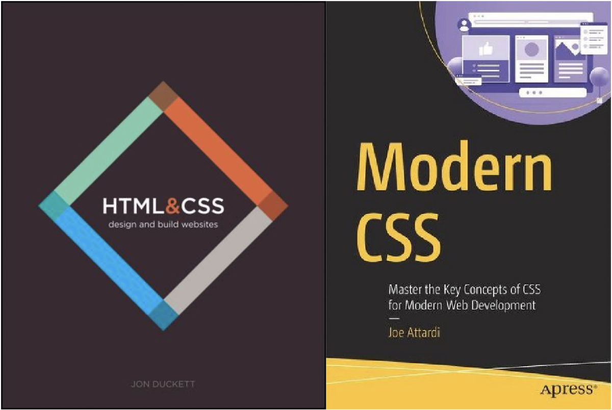
I took another crack at learning HTML & CSS, intending to do it properly this time by reading the entire book without skipping. HTML is the language used to build out the elements on a website and CSS is used to style those elements. They haven’t changed much over the years so the old book I have that was published in 2011 still seems to be relevant. However, to take this learning seriously I got myself another CSS book to cover any changes that make writing a website better.
This time around I had a game plan: I visited SquareSpace, a website service that you can pay for to build any website you want using the pre-designed templates — meaning you only need to supply the content you want to display — to get inspiration on layouts and the feel of things. I looked at most of the templates they have and took notes of elements that I liked and used those to sketch out my own website layout. Researching and drafting out the website was the easy part, building it out with two books worth of knowledge that I’ve acquired in two weeks (because I’m a slow reader) was the hard part.
Here are some things I learned; once I figured out all the kinks, building a website wasn’t too bad. I’m glad that I spent time reading through the books because in the CSS book I learned about flex-box, which made building this website possible. There were other styles, like grids, I could use but flex-box was easier for me to understand. Here are a couple of examples that I had trouble with until I understood how to use it:
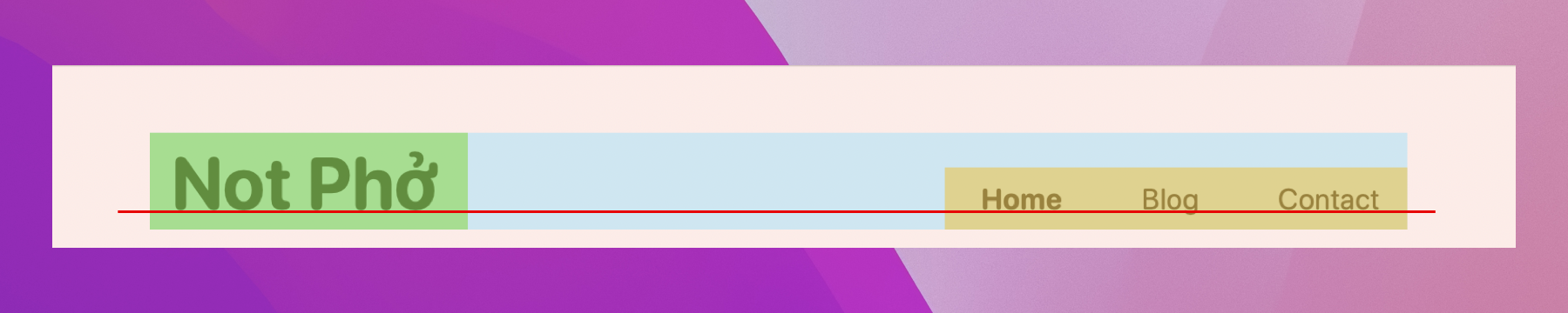
The header was the first thing I built and it gave me a lot of trouble. I began by writing out my elements; first the title, Not Phở, then the three links that allow you to navigate from one page to another, Home, Blog, and Contact, with Home being the default page. HTML displays the elements in the order they are written and from top to bottom, and here I wanted them to be on one line. I also wanted to group the three page links together and align them on the right side the screen. I learned that with flex-box I could display the grouped elements as if they were in a table with rows and columns. So imagine the title being one group and the three links are other group, flex-box allowed me to place them in a row, and with attributes I can put space-between them and adjust the elements to their baseline so their bottoms would align.
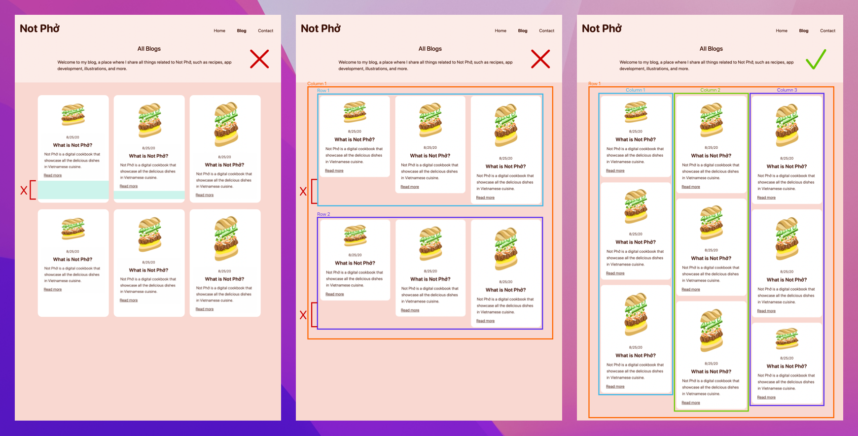
A big motivation for me to rewrite Not Phở’s website was because I wanted to have a blog where I can share all things relating to Not Phở that won’t fit in the app. By the time the website is live, there might not be many articles in the Blog, but the layout with the green checkmark is what I was going for.

I wanted each article card to grow dynamically and only take up the amount of space it needed. I didn’t want to give each card a fixed width and height because if the content is too little there would be extra empty space at the bottom and they wouldn’t look good, but doing it this way would definitely have been easier. Once again, I used the flex-box style to sort out the cards. I gave each card a fixed width because I knew they didn’t need to change, but the height I left alone because it would figure itself out based on the content. The content of the card was laid out with a flex-box that had a column attribute so the content would display from top to bottom.
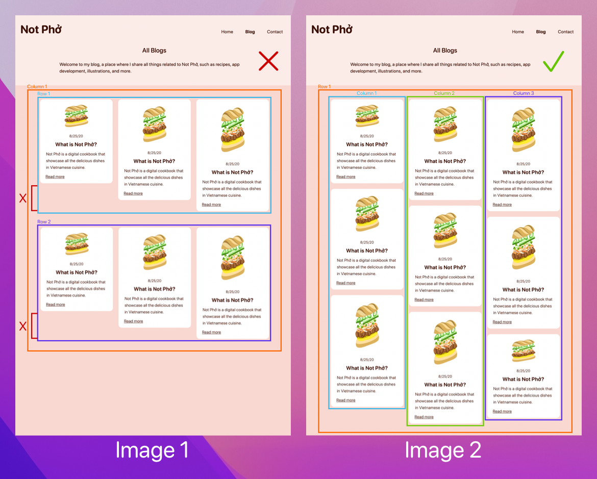
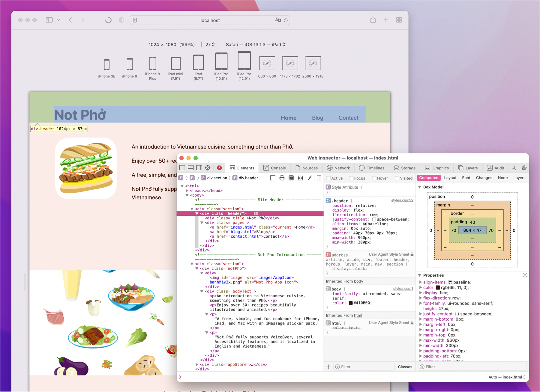
Next, I arranged the cards into columns, allowing each column to have as many cards as it needs, and the columns are contained within another flex-box with the row attribute. The reason why I positioned the cards into columns first and not rows was because I wanted the spacing between all the cards to be the same (Image 2). If I had laid the cards into rows first, since each card might be different heights, the card with the largest height would determine the height of the row, and when the rows are positioned in the column there would be extra empty space between them (Image 1). In the end, the layout that best fit was to place the cards in columns and place those columns into a row (Image 2).
Apart from designing and building a website, there are other aspects to keep in mind, such as different browsers and screen sizes. Since Not Phở is an app that runs only on Apple products and my intention is to link between the app and the website, I took the easy way out and only made it work well in Safari. I'm hopeful the website will run on any web browser, but whether or not there will be breakage to the content I do not know.
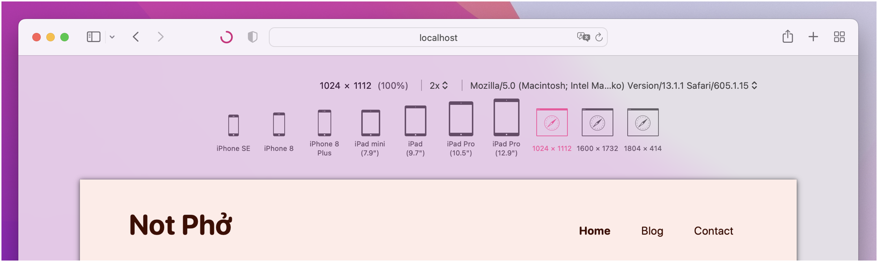
To make the contents look good, I had to consider different screen sizes, and in order to test that out I turned on something called Responsive Design Mode in Safari under the Develop menu. With that mode turned on, I was able to select one device at a time and tweak the CSS until the content was displayed correctly.
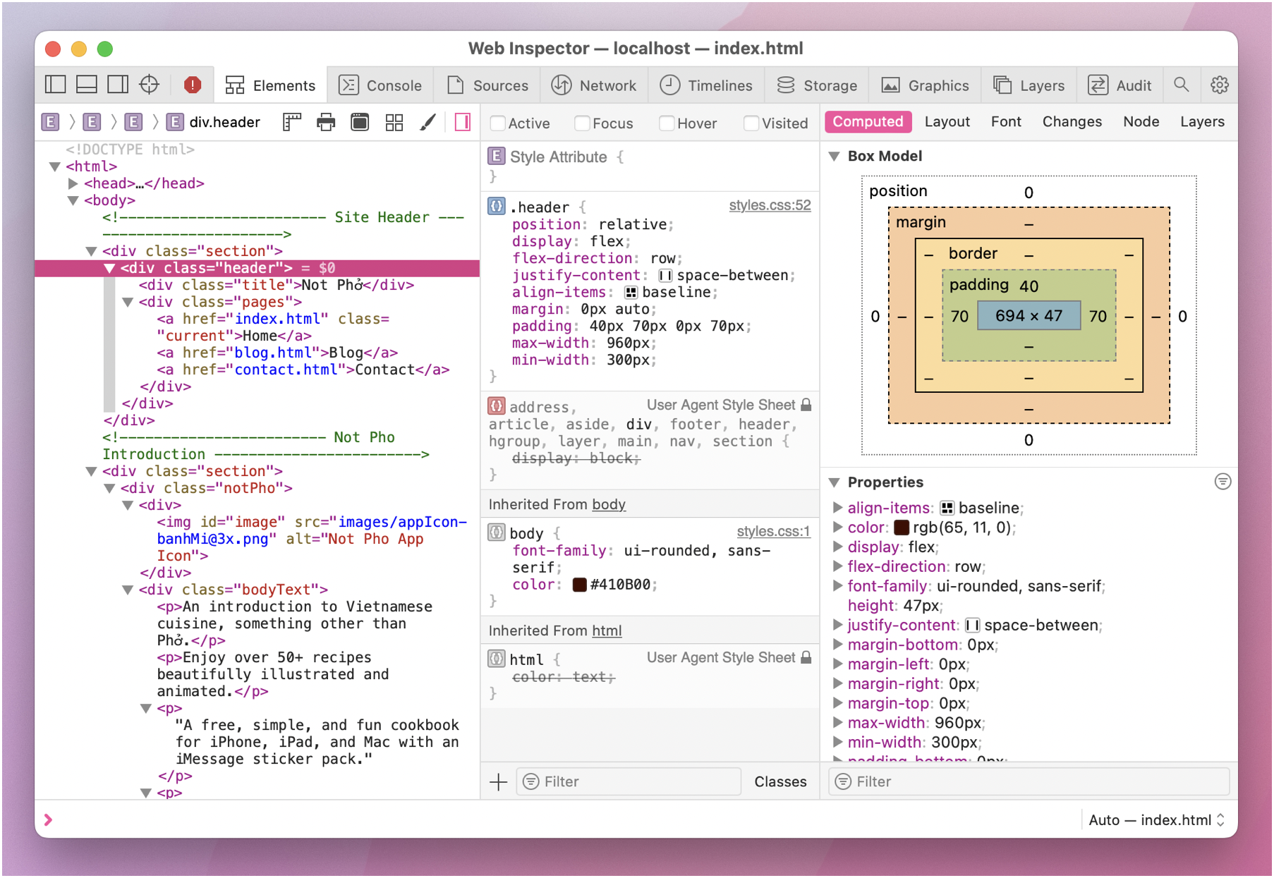
However, having to tweak the CSS file every time for something small like font size or padding and then rebuilding the website to see the result was a bit cumbersome, so I took advantage of something called the Web Inspector to make tweaking easier. To open the web inspector, just right click anywhere on the page and select Inspect Element. The web inspector is a window that shows the HTML & CSS that makes up that website, and tweaking the elements on there will update the website automatically to reflect those changes, and once you are satisfied with the layout you can replicate those changes in the actual CSS file.
This whole journey from reading those books to designing and building out the website took roughly three weeks, and given the amount time I spent on this, I am no expert when it comes to building websites. However, I did gain a ton of experience and there is still more to learn, so maybe next time I can learn to add some animations to make things more interactive and fun.
This was my very first article so I hope it was an okay read for you. If you find this article useful, do share with people you know.
Please support me by downloading Not Phở and help spread the word! Thanks!